
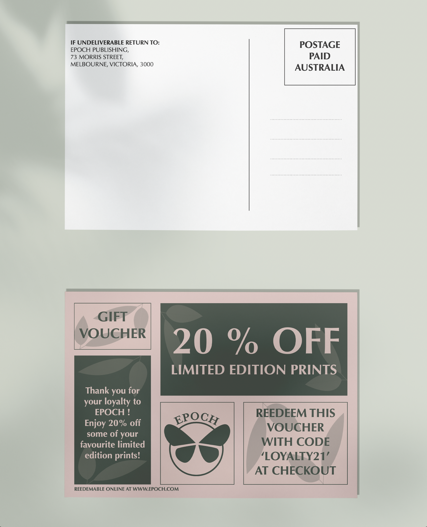
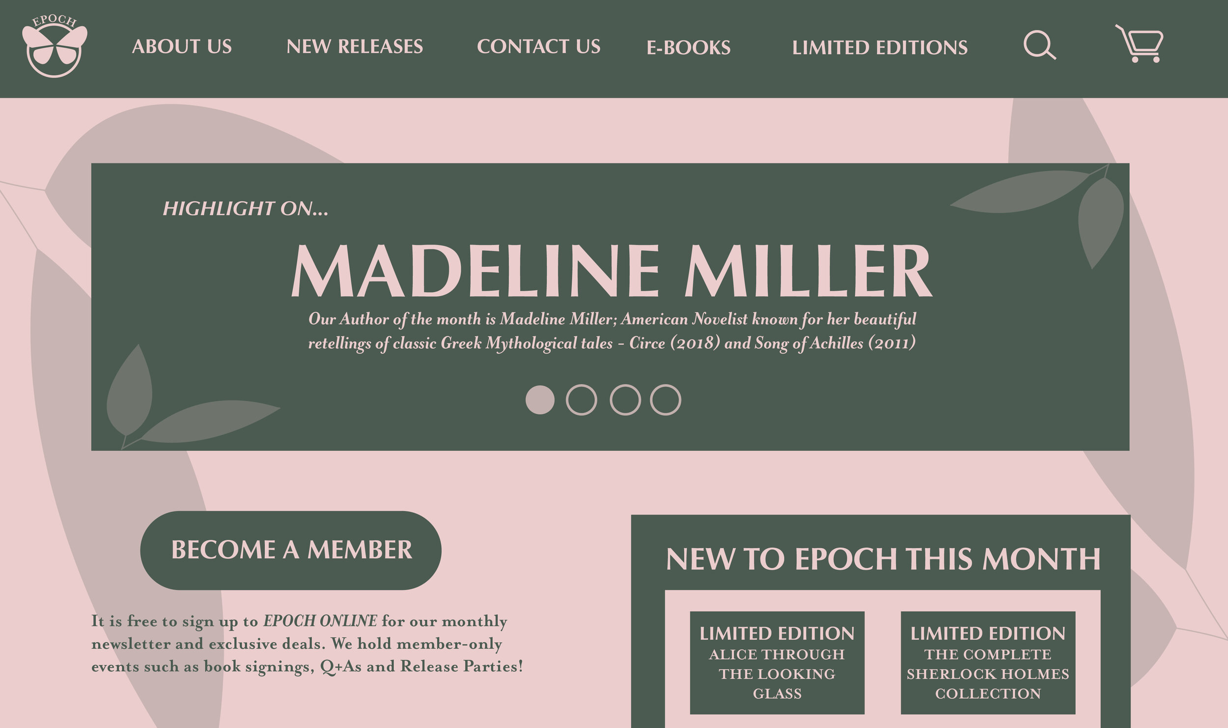
I rebranded a fictional small business for another university assignment. I chose to rebrand ‘EPOCH’ Publishing House. I wanted to make a more youthful and easygoing approach to the branding, without being entirely unprofessional. I used inoffensive colours that are untapped in the industry, that help EPOCH stand out against their competitors. The logo is simple and works in multiple outputs. I created branding collateral that included a website, business cards and a postcard.
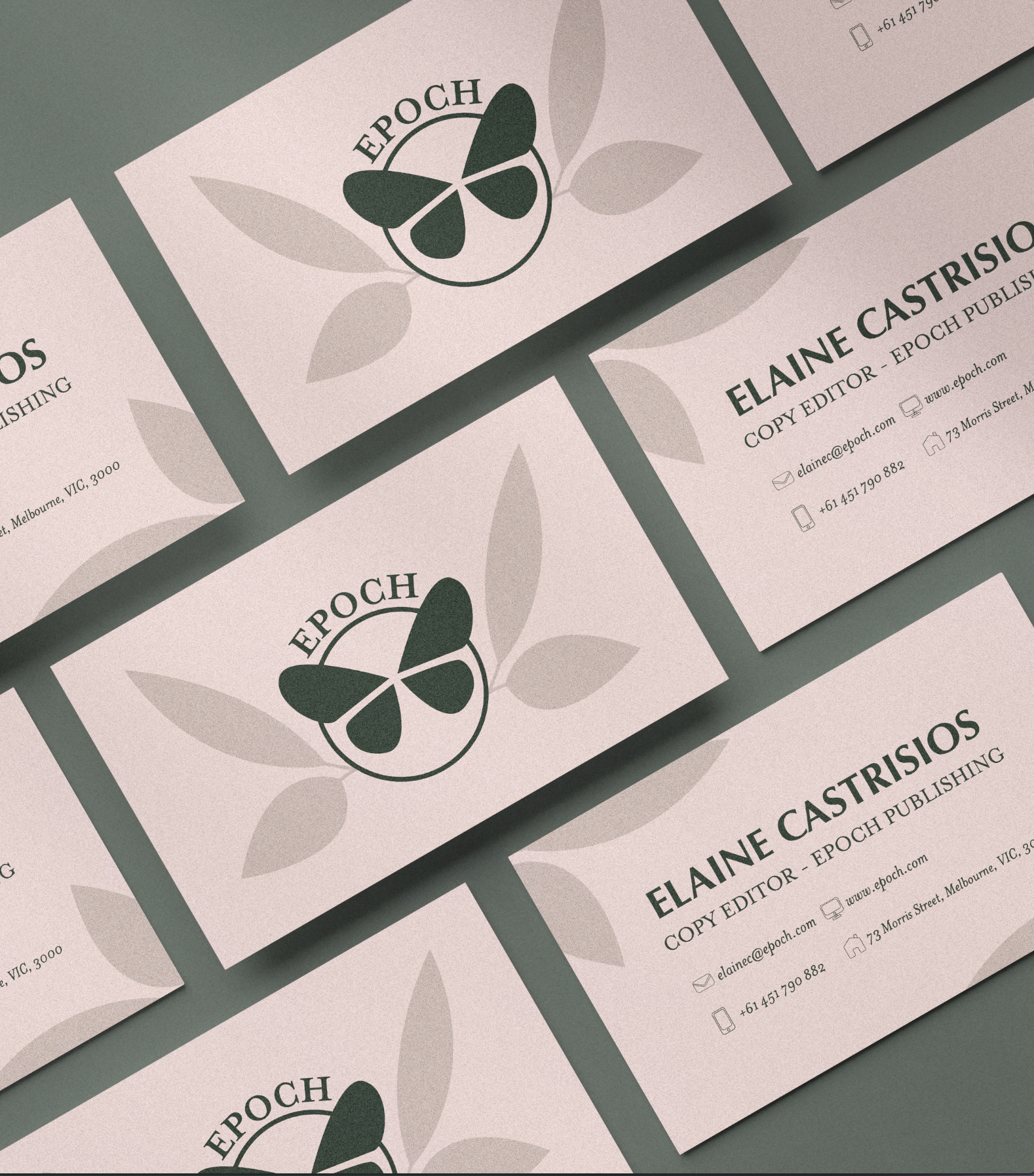
Business Card Mockup
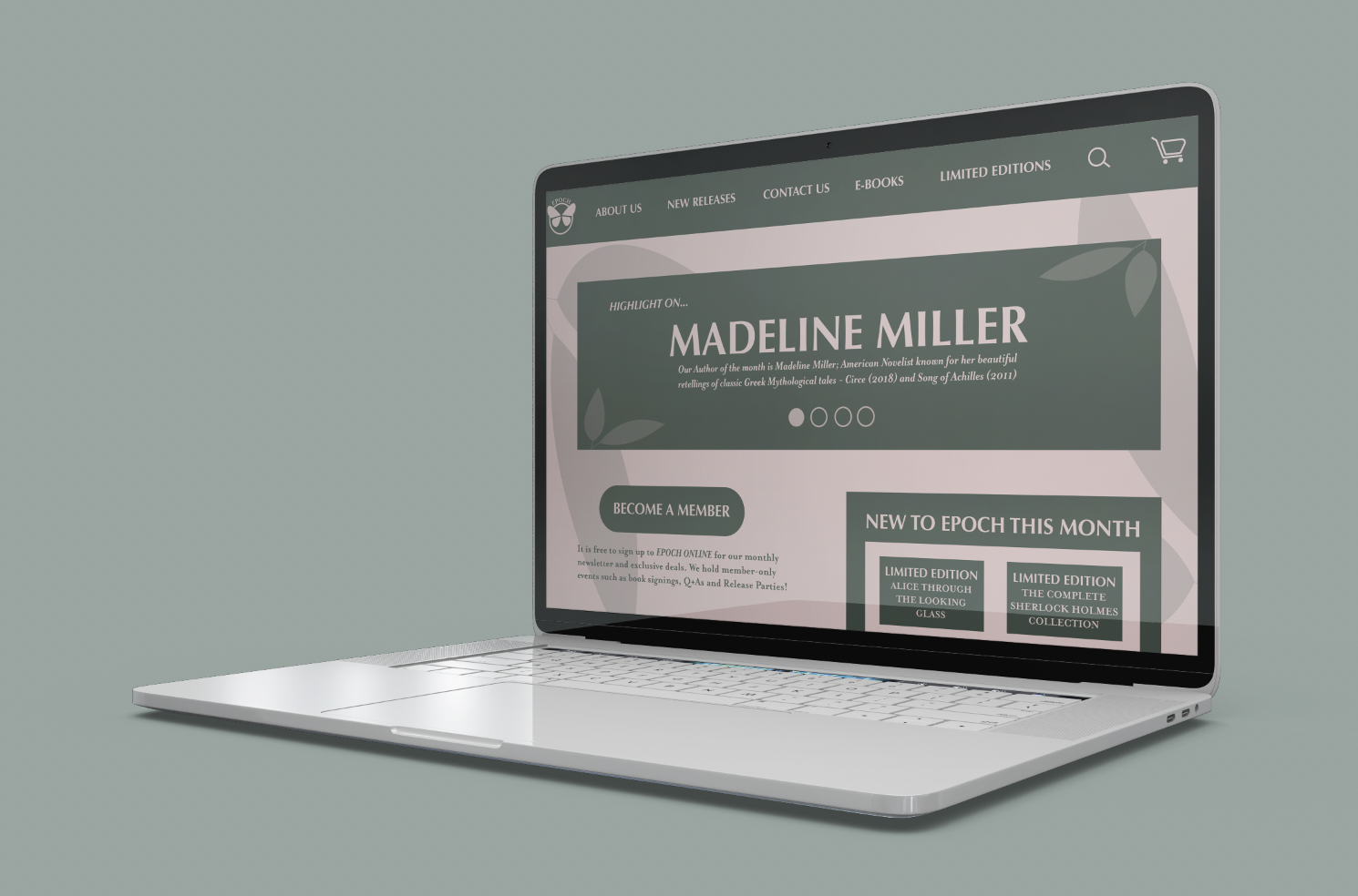
Webiste Mockup
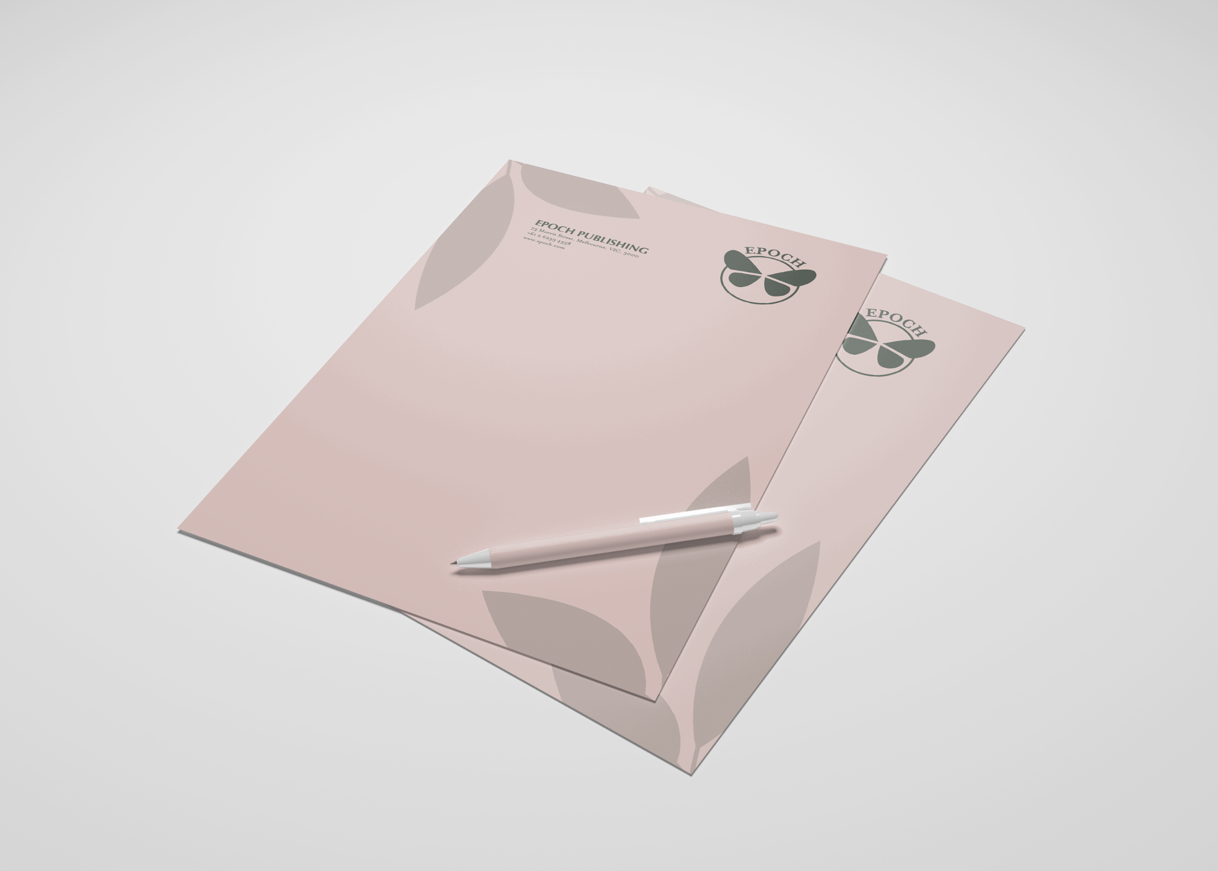
Letterhead Mockup
Website UI Design